第8课:顾及断点的数据插补
作者: 叶粟 (remotesensingsuy@gmail.com)
时间序列数据集: FY3B 土壤湿度
应用: 中国河南
数据插补 是通过基于可用的时间、空间或光谱信息估计合理值,来重建缺失或无效数据(例如,由于云覆盖、传感器故障或采集间隙)的过程。
FY-3B 卫星是一颗于 2010 年 11 月 5 日发射的极轨气象卫星,提供有价值的土壤湿度(SM)观测。空间分辨率为 25 公里。然而,由于其重访轨道的空间覆盖不连续,原始的 FY-3B SM 数据存在大量的时间间隙。为了解决这个问题,Wang 等人 [1] 开发了一个使用时间卷积网络(TCN)进行数据插补的每日 FY-3B SM 数据集。在本课中,我们通过从 Wang 的数据集中随机删除部分每日观测值来模拟原始的 FY-3B SM 数据间隙。然后,我们应用空间连续变化检测(S-CCD)算法进行数据插补。最后,我们比较从 S-CCD 和 TCN 获得的每日 SM 结果,以评估它们的相对性能。
[1] Wang, Q., You, Y., Yang, H., Xu, R., Zhang, H. K., Lu, P., & Tong, X. (2025). A TCN-Transformer Parallel model for reconstruction of a global, daily, spatially seamless FY-3B soil moisture dataset. Remote Sensing of Environment, 328, 114841.
我们使用 S-CCD 模型拟合来进行数据插补。与单一的全局拟合相比,S-CCD 首先识别时间断点,然后逐段拟合时间序列,这通常能产生比一次性拟合更小的均方根误差(RMSE)。在 S-CCD 中有三种常见的模型拟合配置(详见第 5 课):(1)直接求和所有状态分量;(2)使用一个时间段内的所有观测值应用 lasso 回归(fitting_coefs=True);(3)使用卡尔曼滤波器在最后一个观测处滤波得到的时间特定谐波模型系数(fitting_coefs=False);
对于数据插补,我们推荐使用第一种方法,即求和所有状态分量,以追求顾及局部波动的最佳拟合。我们需要通过设置 state_intervaldays 来输出 S-CCD 状态,以执行最佳的数据插补。
每日土壤湿度数据集
import numpy as np
import pathlib
import pandas as pd
from typing import List, Tuple, Dict, Union, Optional
from matplotlib.axes import Axes
import seaborn as sns
import matplotlib.pyplot as plt
from pyxccd import sccd_detect
from pyxccd.common import SccdOutput
from pyxccd.utils import getcategory_sccd, defaults

TUTORIAL_DATASET = (pathlib.Path.cwd() / 'datasets').resolve() # modify it as you need
assert TUTORIAL_DATASET.exists()
in_path = TUTORIAL_DATASET/ '8_gapfilling_FY3B.csv'

# read example csv for HLS time series
data = pd.read_csv(in_path)
calendar_dates = [pd.Timestamp.fromordinal(int(row)) for row in data["dates"]]
data.loc[:, 'dates_formal'] = calendar_dates
data.SM = data.SM.multiply(10000)
# split the array by the column
# dates, SM = data.to_numpy().copy().T

sns.set_theme(style="darkgrid")
fig, ax = plt.subplots(figsize=(12, 4))
g = sns.lineplot(
    x="dates_formal", y="SM",
    data=data,
    label="Daily soil moisture",
    ax = ax
)

采样时间序列的数据插补
import pandas as pd
import numpy as np
import pathlib
from dateutil import parser
import pathlib
from datetime import date
from typing import List, Tuple, Dict, Union, Optional
import seaborn as sns
import matplotlib.pyplot as plt
from matplotlib.axes import Axes
from matplotlib.lines import Line2D

from pyxccd import sccd_detect_flex
from pyxccd.utils import defaults, predict_ref
from pyxccd.common import SccdOutput, cold_rec_cg, anomaly

def display_sccd_result_single(
    data: np.ndarray,
    band_names: List[str],
    band_index: int,
    sccd_result: SccdOutput,
    axe: Axes,
    title: str = 'S-CCD',
    states:Optional[pd.DataFrame] = None,
    trimodal: bool = False,
    anomaly:Optional[anomaly] = None,
    plot_kwargs: Optional[Dict] = None
) -> Tuple[plt.Figure, List[plt.Axes]]:
    """
    Compare COLD and SCCD change detection algorithms by plotting their results side by side.

    This function takes time series remote sensing data, applies both COLD and SCCD algorithms,
    and visualizes the curve fitting and break detection results for comparison.

    Parameters:
    -----------
    data : np.ndarray
        Input data array with shape (n_observations, n_bands + 2) where:
        - First column: ordinal dates (days since January 1, AD 1)
        - Next n_bands columns: spectral band values
        - Last column: QA flags (0-clear, 1-water, 2-shadow, 3-snow, 4-cloud)

    band_names : List[str]
        List of band names corresponding to the spectral bands in the data (e.g., ['red', 'nir'])

    band_index : int
        1-based index of the band to plot (e.g., 0 for first band, 1 for second band)

    sccd_result: SccdOutput
        Output of sccd_detect

    axe: Axes
        An Axes object represents a single plot within that Figure

    title: Str
        The figure title. The default is "S-CCD"

    states: pd.Dataframe
        S-CCD state outputs

    trimodal: bool
        indicate whether using trimodal

    anomaly: anomaly, optional
        The anomaly detection outputs
    plot_kwargs : Dict, optional
        Additional keyword arguments to pass to the display function. Possible keys:
        - 'marker_size': size of observation markers (default: 5)
        - 'marker_alpha': transparency of markers (default: 0.7)
        - 'line_color': color of model fit lines (default: 'orange')
        - 'font_size': base font size (default: 14)

    Returns:
    --------
    Tuple[plt.Figure, List[plt.Axes]]
        A tuple containing the matplotlib Figure object and a list of Axes objects
        (top axis is COLD results, bottom axis is SCCD results)

    """
    if trimodal:
        n_coefs = 8
    else:
        n_coefs = 6
    w = np.pi * 2 / 365.25

    # Set default plot parameters
    default_plot_kwargs: Dict[str, Union[int, float, str]] = {
        'marker_size': 5,
        'marker_alpha': 0.7,
        'line_color': 'orange',
        'font_size': 14
    }
    if plot_kwargs is not None:
        default_plot_kwargs.update(plot_kwargs)

    # Extract values with proper type casting
    font_size = default_plot_kwargs.get('font_size', 14)
    try:
        title_font_size = int(font_size) + 2
    except (TypeError, ValueError):
        title_font_size = 16


    # Clean and prepare data
    data = data[np.all(np.isfinite(data), axis=1)]
    data_df = pd.DataFrame(data, columns=['dates'] + band_names + ['qa'])


    # Plot COLD results
    w = np.pi * 2 / 365.25
    slope_scale = 10000

    # Prepare clean data for COLD plot
    data_clean = data_df[(data_df['qa'] == 0) | (data_df['qa'] == 1)].copy()
    data_clean =  data_clean[(data_clean >= 0).all(axis=1) & (data_clean.drop(columns="dates") <= 10000).all(axis=1)]
    calendar_dates = [pd.Timestamp.fromordinal(int(row)) for row in data_clean["dates"]]
    data_clean.loc[:, 'dates_formal'] = calendar_dates

    # Calculate y-axis limits
    band_name = band_names[band_index]
    band_values = data_clean[data_clean['qa'] == 0 | (data_clean['qa'] == 1)][band_name]
    # band_values  = band_values[band_values <10000]
    q01, q99 = np.quantile(band_values, [0.01, 0.99])
    extra = (q99 - q01) * 0.4
    ylim_low = q01 - extra
    ylim_high = q99 + extra

    # Plot SCCD observations
    axe.plot(
        'dates_formal', band_name, 'go',
        markersize=default_plot_kwargs['marker_size'],
        alpha=default_plot_kwargs['marker_alpha'],
        data=data_clean
    )

    # Plot SCCD segments
    if states is not None:
        if trimodal is True:
            states['predicted'] = states['b0_trend']+states['b0_annual']+states['b0_semiannual']+states['b0_trimodal']
        else:
            states['predicted'] = states['b0_trend']+states['b0_annual']+states['b0_semiannual']
        calendar_dates = [pd.Timestamp.fromordinal(int(row)) for row in states["dates"]]
        states.loc[:, 'dates_formal'] = calendar_dates
        g = sns.lineplot(
            x="dates_formal", y="predicted",
            data=states,
            label="Model fit",
            ax=axe,
            color=default_plot_kwargs['line_color']
        )
        if g.legend_ is not None:
            g.legend_.remove()
    else:
        for segment in sccd_result.rec_cg:
            j = np.arange(segment['t_start'], segment['t_break'] + 1, 1)
            if trimodal == True:
                plot_df = pd.DataFrame(
                    {
                    'dates': j,
                    'trend': j * segment['coefs'][band_index][1] / slope_scale + segment['coefs'][band_index][0],
                    'annual': np.cos(w * j) * segment['coefs'][band_index][2] + np.sin(w * j) * segment['coefs'][band_index][3],
                    'semiannual': np.cos(2 * w * j) * segment['coefs'][band_index][4] + np.sin(2 * w * j) * segment['coefs'][band_index][5],
                    'trimodal': j * 0
                })

            else:
                plot_df = pd.DataFrame(
                    {
                    'dates': j,
                    'trend': j * segment['coefs'][band_index][1] / slope_scale + segment['coefs'][band_index][0],
                    'annual': np.cos(w * j) * segment['coefs'][band_index][2] + np.sin(w * j) * segment['coefs'][band_index][3],
                    'semiannual': np.cos(2 * w * j) * segment['coefs'][band_index][4] + np.sin(2 * w * j) * segment['coefs'][band_index][5],
                    'trimodal': np.cos(3 * w * j) * segment['coefs'][band_index][6] + np.sin(3 * w * j) * segment['coefs'][band_index][7]
                })


            # Convert dates and plot model fit
            calendar_dates = [pd.Timestamp.fromordinal(int(row)) for row in plot_df["dates"]]
            plot_df.loc[:, 'dates_formal'] = calendar_dates
            g = sns.lineplot(
                x="dates_formal", y="predicted",
                data=plot_df,
                label="Model fit",
                ax=axe,
                color=default_plot_kwargs['line_color']
            )
            if g.legend_ is not None:
                g.legend_.remove()

        # Plot near-real-time projection for SCCD if available
        if hasattr(sccd_result, 'nrt_mode') and (sccd_result.nrt_mode %10 == 1 or sccd_result.nrt_mode == 3 or sccd_result.nrt_mode %10 == 5):
            recent_obs = sccd_result.nrt_model['obs_date_since1982'][sccd_result.nrt_model['obs_date_since1982']>0]
            j = np.arange(
                sccd_result.nrt_model['t_start_since1982'] + defaults['COMMON']['JULIAN_LANDSAT4_LAUNCH'],
                recent_obs[-1]+ defaults['COMMON']['JULIAN_LANDSAT4_LAUNCH']+1,
                1
            )

            if trimodal == True:
                plot_df = pd.DataFrame(
                    {
                    'dates': j,
                    'trend': j * sccd_result.nrt_model['nrt_coefs'][band_index][1] / slope_scale + sccd_result.nrt_model['nrt_coefs'][band_index][0],
                    'annual': np.cos(w * j) * sccd_result.nrt_model['nrt_coefs'][band_index][2] + np.sin(w * j) * sccd_result.nrt_model['nrt_coefs'][band_index][3],
                    'semiannual': np.cos(2 * w * j) * sccd_result.nrt_model['nrt_coefs'][band_index][4] + np.sin(2 * w * j) * sccd_result.nrt_model['nrt_coefs'][band_index][5],
                    'trimodal': np.cos(3 * w * j) * sccd_result.nrt_model['nrt_coefs'][band_index][6] + np.sin(3 * w * j) * sccd_result.nrt_model['nrt_coefs'][band_index][7]
                })
            else:
                plot_df = pd.DataFrame(
                    {
                    'dates': j,
                    'trend': j * sccd_result.nrt_model['nrt_coefs'][band_index][1] / slope_scale + sccd_result.nrt_model['nrt_coefs'][band_index][0],
                    'annual': np.cos(w * j) * sccd_result.nrt_model['nrt_coefs'][band_index][2] + np.sin(w * j) * sccd_result.nrt_model['nrt_coefs'][band_index][3],
                    'semiannual': np.cos(2 * w * j) * sccd_result.nrt_model['nrt_coefs'][band_index][4] + np.sin(2 * w * j) * sccd_result.nrt_model['nrt_coefs'][band_index][5],
                    'trimodal': j * 0
                })

            plot_df['predicted'] = plot_df['trend'] + plot_df['annual'] + plot_df['semiannual']+ plot_df['trimodal']
            calendar_dates = [pd.Timestamp.fromordinal(int(row)) for row in plot_df["dates"]]
            plot_df.loc[:, 'dates_formal'] = calendar_dates
            g = sns.lineplot(
                x="dates_formal", y="predicted",
                data=plot_df,
                label="Model fit",
                ax=axe,
                color=default_plot_kwargs['line_color']
            )
            if g.legend_ is not None:
                g.legend_.remove()

    # add manual legends
    if anomaly is not None:
        legend_elements = [Line2D([0], [0], label='Disturbance break', color='k'),
                            Line2D([0], [0], label='recovery break', color='r'),
                            Line2D([0], [0], marker='o', color="#EAEAF2",
                            markerfacecolor="#EAEAF2",markeredgecolor="black",
                            label='Disturbance anomalies', lw=0, markersize=8),
                            Line2D([0], [0], marker='o', color="#EAEAF2",
                            markerfacecolor="#EAEAF2",markeredgecolor="red",
                            label='Recovery anomalies', lw=0, markersize=8)]
    else:
        legend_elements = [Line2D([0], [0], label='Disturbance break', color='k'),
                    Line2D([0], [0], label='recovery break', color='r')]
    axe.legend(handles=legend_elements, loc='upper left', prop={'size': 9})

    # plot breaks
    for i in range(len(sccd_result.rec_cg)):
        # we used the sign of change magnitude to decide the category of the breaks
        if sccd_result.rec_cg[i]['magnitude'] < 0:
            axe.axvline(pd.Timestamp.fromordinal(sccd_result.rec_cg[i]['t_break']), color='k')
        else:
            axe.axvline(pd.Timestamp.fromordinal(sccd_result.rec_cg[i]['t_break']), color='r')


    # plot anomalies if available
    if anomaly is not None:
        for i in range(len(anomaly.rec_cg_anomaly)):
            pred_ref = np.asarray(
                    [
                        predict_ref(
                            anomaly.rec_cg_anomaly[i]["coefs"][0],
                            anomaly.rec_cg_anomaly[i]["obs_date_since1982"][i_conse]
                            + defaults['COMMON']['JULIAN_LANDSAT4_LAUNCH'], num_coefficients=n_coefs
                        ) for i_conse in range(3)
                    ]
            )

            cm = anomaly.rec_cg_anomaly[i]["obs"][0, 0: 3] - pred_ref

            # gpp increase is black line
            if np.median(cm) > 0:
                yc = data[data[:,0] == anomaly.rec_cg_anomaly[i]['t_break']][0][1]
                axe.plot(pd.Timestamp.fromordinal(anomaly.rec_cg_anomaly[i]['t_break']), yc,'ro',fillstyle='none',markersize=8)
            # gpp decrease is red line
            else:
                yc = data[data[:,0] == anomaly.rec_cg_anomaly[i]['t_break']][0][1]
                axe.plot(pd.Timestamp.fromordinal(anomaly.rec_cg_anomaly[i]['t_break']), yc,'ko',fillstyle='none',markersize=8)

    axe.set_ylabel(f"{band_name}", fontsize=default_plot_kwargs['font_size'])

    # Handle tick params with type safety
    tick_font_size = default_plot_kwargs['font_size']
    if isinstance(tick_font_size, (int, float)):
        axe.tick_params(axis='x', labelsize=int(tick_font_size)-1)
    else:
        axe.tick_params(axis='x', labelsize=13)  # fallback

    axe.set(ylim=(ylim_low, ylim_high))
    axe.set_xlabel("", fontsize=6)

    # Format spines
    for spine in axe.spines.values():
        spine.set_edgecolor('black')
    title_font_size = int(font_size) + 2 if isinstance(font_size, (int, float)) else 16
    axe.set_title(title, fontweight="bold", size=title_font_size, pad=2)


sampling_rate = 0.3
data_selected = data.sample(int(len(data) * sampling_rate))

data_selected['qa'] = np.zeros(data_selected.shape[0])

# need to multiply by 10000 to scale up into integer
dates, sm,  qas = data_selected[['dates', 'SM', 'qa']].to_numpy().astype(np.int64).copy().T


fig, axes = plt.subplots(2, 1, figsize=(12, 7))
plt.subplots_adjust(hspace=0.4)

# we used lam=0 and trimodal=True to achieve the best model fitting although might over-detect breaks
sccd_results, states = sccd_detect_flex(dates, sm, qas, lam=0, trimodal=True, state_intervaldays=1)
states['predicted'] = states['b0_trend']+states['b0_annual']+states['b0_semiannual']+states['b0_trimodal']
calendar_dates = [pd.Timestamp.fromordinal(int(row)) for row in states["dates"]]
states.loc[:, 'dates_formal'] = calendar_dates

display_sccd_result_single(data=data_selected[['dates', 'SM', 'qa']].to_numpy(), band_names=['SM'], band_index=0, sccd_result=sccd_results, axe=axes[0], trimodal=True, states=states, title=f"S-CCD gap filling (sampling rate {sampling_rate})")

g = sns.lineplot(
    x="dates_formal", y="SM",
    data=data,
    label="TCN SM",
    ax = axes[1]
)
g = sns.lineplot(
    x="dates_formal", y="predicted",
    data=states,
    label="S-CCD SM",
    ax = axes[1]
)

axes[1].set_title('TCN vs S-CCD fitting', fontsize=16, fontweight='bold')
Text(0.5, 1.0, 'TCN vs S-CCD fitting')
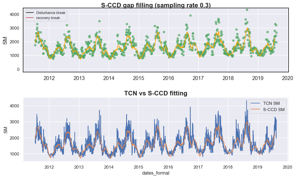
与时间卷积网络(TCN)相比,S-CCD 方法生成的土壤湿度轨迹更平滑,而 TCN 导出的曲线表现出更大的波动性。这种差异源于 TCN 预测包含了多个环境变量,而 S-CCD 主要依赖于自回归时间模型。鉴于土壤湿度动态通常表现出强时间持续性并依赖于多日前条件,S-CCD 生成的更平滑曲线可能更能代表实际的物理过程——尽管在我们的案例中尚未对此进行定量验证。
值得注意的是,与传统的用于时间序列重建的谐波回归技术(如 HANTS)相比,S-CCD 具有两个主要优势:
顾及局部波动:S-CCD 在局部时间窗口内自适应地进行模型拟合,使其能够捕捉短期变化,例如本案例中在 2018 年底观察到的局部峰值。
处理与土地覆盖动态相关的结构断裂:当土地覆盖发生变化时,现有的模型系数可能变得无效。包括 S-CCD 在内的类似 CCDC 的方法会自动重建模型参数以适应这种非平稳条件,从而随时间保持模型的稳健性。
尝试不同的时间密度
让我们尝试提高采样率,看看 S-CCD 的预测是否稳定。
sampling_rate = 0.7
data_selected = data.sample(int(len(data) * sampling_rate))

data_selected['qa'] = np.zeros(data_selected.shape[0])

# need to multiply by 10000 to scale up into integer
dates, sm,  qas = data_selected[['dates', 'SM', 'qa']].to_numpy().astype(np.int64).copy().T


fig, axes = plt.subplots(2, 1, figsize=(12, 7))
plt.subplots_adjust(hspace=0.4)

sccd_results2, states2 = sccd_detect_flex(dates, sm, qas, p_cg=0.999, lam=0, trimodal=True, state_intervaldays=1)
states2['predicted'] = states2['b0_trend']+states2['b0_annual']+states2['b0_semiannual']+states2['b0_trimodal']
calendar_dates2 = [pd.Timestamp.fromordinal(int(row)) for row in states2["dates"]]
states2.loc[:, 'dates_formal'] = calendar_dates2


g = sns.lineplot(
    x="dates_formal", y="SM",
    data=data,
    label="TCN SM",
    ax = axes[0]
)
g = sns.lineplot(
    x="dates_formal", y="predicted",
    data=states,
    label="S-CCD SM",
    ax = axes[0]
)


g = sns.lineplot(
    x="dates_formal", y="SM",
    data=data,
    label="TCN SM",
    ax = axes[1]
)
g = sns.lineplot(
    x="dates_formal", y="predicted",
    data=states2,
    label="S-CCD SM",
    ax = axes[1]
)

axes[0].set_title('TCN vs S-CCD (sampling rate=0.3)', fontsize=16, fontweight='bold')
axes[1].set_title('TCN vs S-CCD (sampling rate=0.7)', fontsize=16, fontweight='bold')
Text(0.5, 1.0, 'TCN vs S-CCD (sampling rate=0.7)')
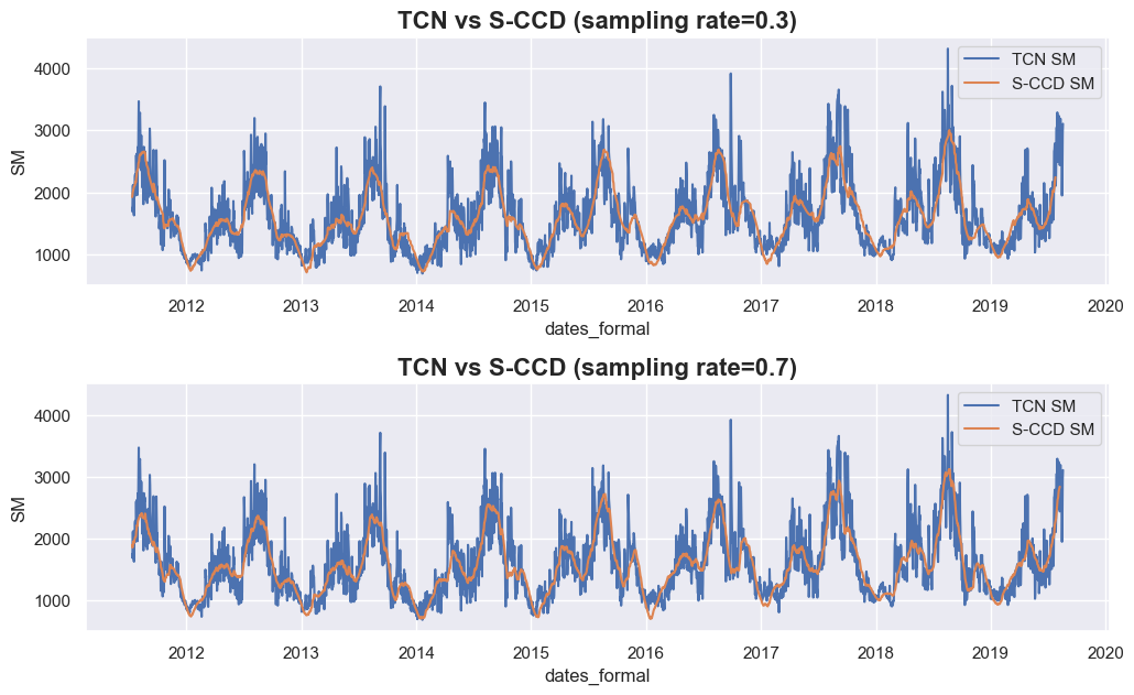
从上述结果来看,当我们将采样率从 0.3 提高到 0.7 时,S-CCD 的拟合曲线(黄色曲线)仅显示出略有不同的数据插补结果(例如 sampling rate=0.3 在 2014 年第一个峰值处取得较低的值),这表明在不同采样率下数据插补的性能通常是稳健的。